Yesterday we reported to you on the growing controversy about U2's artwork for their upcoming album No Line On The Horizon.
Electronic artist Taylor Deupree, who along with Richard Chartier issued an album called Specification.Fifteen several years ago that uses the seascape image called Boden Sea, Uttwil, designed by Japanese artist and Hiroshi Sugimoto (the very same image that graces U2's cover), has been especially vocal, even calling the Irish supergroup's artwork a 'rip-off.'
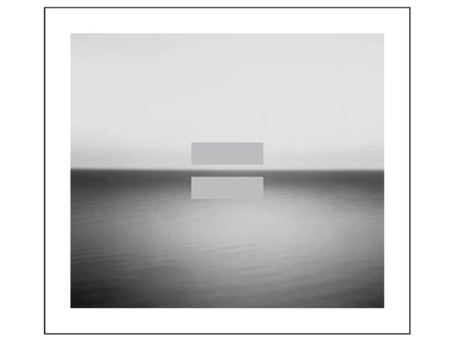
Below, Chartier and Deupree's album appears on the left, while U2's is on the right. The noticeable difference on U2's No Line On The Horizon is, of course, the addition of a large 'equals' symbol.

U2 posts interview with designer
"I think we're doing something different with Sugimoto's image, something uniquely connected with this latest body of work from U2" designer Shaughn McGrath, discussing the artwork controversy
Coincidentally or not, U2 have posted an interview with Shaughn McGrath from the design team Four5One, in which the similarity between the two album covers is addressed.
"We felt it was such an emotive image," says McGrath, "that there was a natural coherence with the album's themes, that suggested release. And so we set this beautiful, velvet image of Sugimoto's very simply in a white surround."
What's with the 'equals' sign?
According to McGrath, "It adds to the album's visual idiom. Whatever the culture and language spoken, this universal mathematical symbol is understood, and so it complements the clarity of expression in the image. What we love about the equals sign is the simplicity, the purity - like the title, No Line On The Horizon."
Rip-off or not?
When asked about the fact that the image of the Boden Sea had been used previously on another album cover, McGrath said, "I've just heard about that album and its cover. But I think we're doing something different with Sugimoto's image, something uniquely connected with this latest body of work from U2.
"And while I'm pleased we've been able to do something that has so few brushstrokes and yet says so much, the response to the design of an album is connected with how well people connect with the album.
"To give you an earlier example, the first album I worked on with U2 was Achtung Baby in 1991 - that sleeve is widely admired, but probably because the album is so great. People love that cover because they came to love the album. These things don't exist in isolation. It's all connected to the music."
Personally, MusicRadar sees the use of the seascape image on U2's album cover as creative and an extension of pop art. Think for a second: Did Andy Warhol create the Campbell's soup can? Of course not. With his inventive silkscreens, did he turn the label into a work of art? Without a doubt. Did Jimmy Page invent the blues? Hardly. In Led Zeppelin did he magnify the idiom into something majestic and magnificent? You betcha.
Art borrows, pushes, goes a step further.
You can read the entire interview with McGrath on the U2 website.
